

Column: 2021 NBA City edition jerseys naughty or nice list
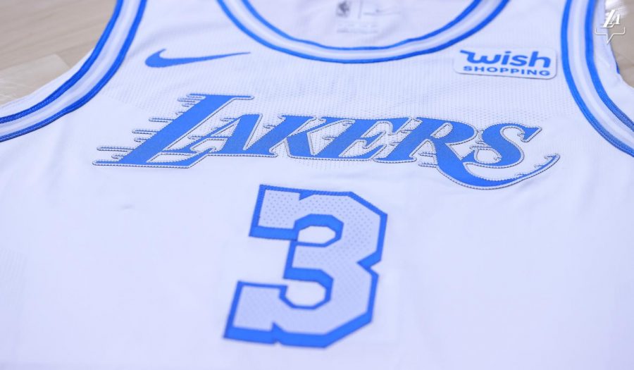
Image credit sportslogos.net
December 17, 2020
There are few things more synonymous than Christmas Day and the NBA, and leading up to the new NBA season’s tipoff Dec. 22, fans will be making their holiday wish lists. With 30 teams to choose from, fans may find difficulty deciding where to spend their dollars.
Have no fear, basketball fans. Santa Mitch is here to help.
The Naughty List
Jerseys that made this list missed the mark in one or more categories: style and aesthetic appeal, representation of the city and overall freshness.
New York Knicks
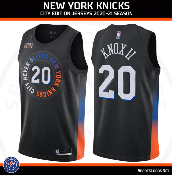
In typical Knicks fashion, the team somehow found a way to screw up their classic orange and blue color scheme, using the two in a gradient fashion as a side panel running down the jersey. The words “City that never sleeps” are written in all caps in a circle in the same white-blue-orange gradient with the center chest’s player number. One thing is for sure: fans will sleep soundly not purchasing this sad excuse of a jersey for a city’s pathetic excuse of a team.
Miami Heat
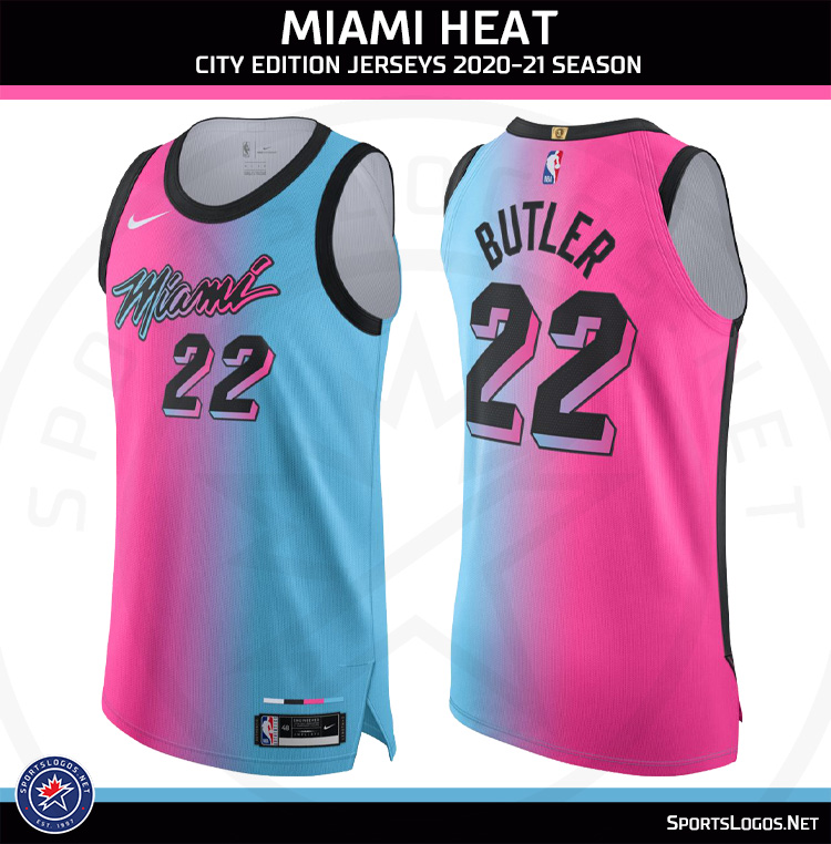
The Heat ran a successful Miami vice inspired jersey as their ‘City Edition Threads’ , with white, black, and electric blue variations to fans jubilation. This season, Miami must be hosting a carnival because their 2021 city jerseys are reminiscent of pink and blue cotton candy. The pink-blue gradient on the jersey accompanied by “Miami” in black, outlined by both pink and blue, gives off a “soft” vibe for some of the most formidable working players and staff in the association.
Washington Wizards
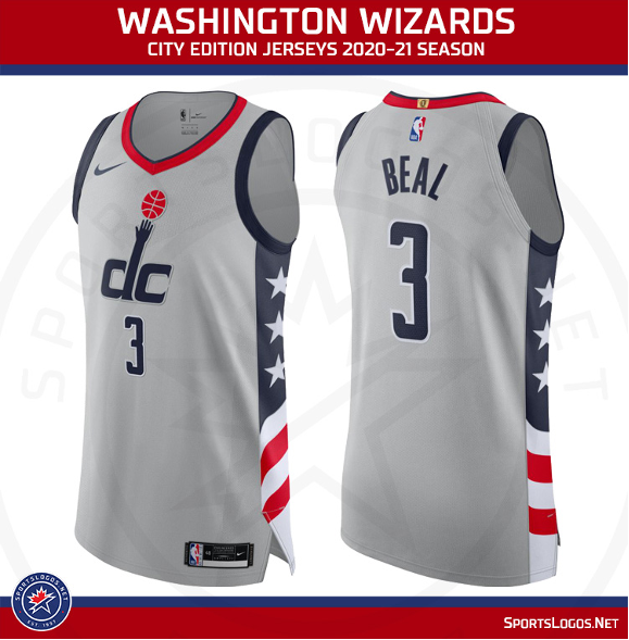
The Wizards jersey in gray with the American flag running down the side is patriotic and clean, but it’s not exciting or innovative. In the city edition, jerseys should represent the city teams play in, not their country. The gray is monochromatic and dull, and the use of their standard logo on the chest is uninventive. A District of Columbia flag inspired jersey would have been nice to see.
Philadelphia 76ers
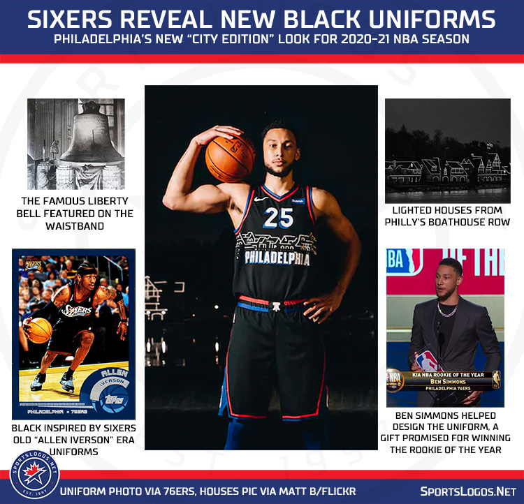
Philly’s return to a black jersey falls short this season. The skyline of homes representing the homes on Philadelphia’s Boathouse Row falls as close to the basket as a Ben Simmons three-point shot: short. The skyline paired with the condensed font spelling out “Philadelphia” is too busy for the eye to handle. The jersey is reminiscent of a school kid drawing on a blackboard. Stick to the red, white and blue, Philly. It’s the only process that has ever worked out for you.
Los Angeles Lakers
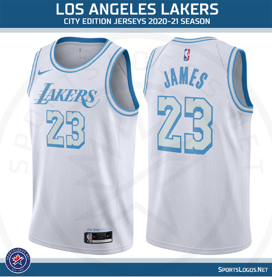
The Lakers dusted off their old jerseys from the 1960s in the Elgin Baylor inspired white and blue jersey for the upcoming season. The light blue and white are a departure from the purple and gold and the departure is refreshing. The jersey falls short in execution. The opportunity to display the 1960s “Los Angeles” scripted font across the chest was missed, and the misjudgment is what separates this mediocre city jersey from being elite.
The Nice List
Jerseys that made this list overachieved in one or more categories: style and aesthetic appeal, representation of the city and overall freshness.
Dallas Mavericks
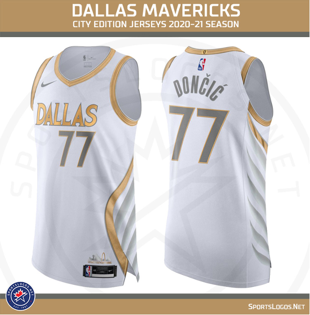
The Mavs will honor the 10th anniversary of their lone 2011 championship and the franchise’s 40th birthday with the white and gold city jersey. Gracing the side panels are the wings of a Pegasus, the creature that watches over all of Dallas. The mythical wings fit a team that boasts two mythical superstars in Kristaps Porzingis and Luka Doncic.
New Orleans Pelicans
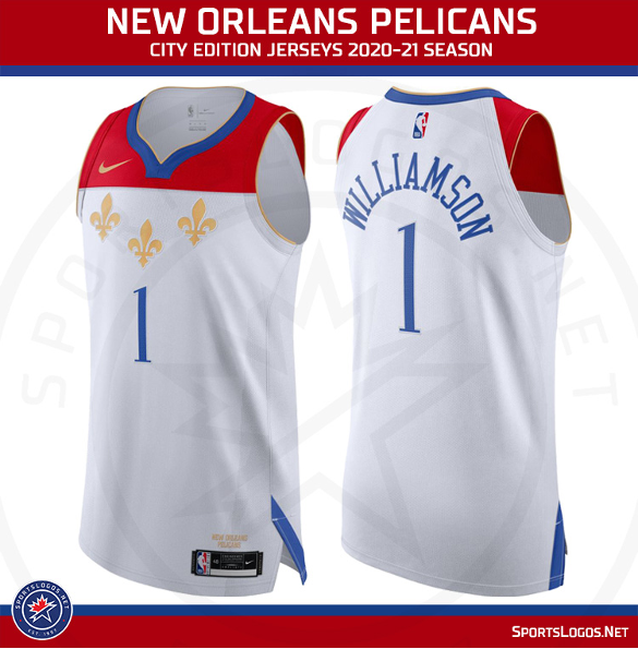
The Pelicans pay homage to the city of New Orleans, literally playing with the city flag across their entire jersey. The red, white, and blue horizontal stripes accompanied by three gold fleur de lis are an accurate representation of NOLA. A departure from the purple and green Mardi Gras themes jerseys of the past, and fans can look forward to Zion Williamson rocking the fleur de lis for the city of New Orleans.
Portland Trail Blazers
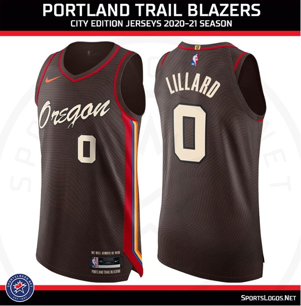
Dubbed the “Spirit of Oregon,” the Blazers city jersey captures iconic aspects of Portland. Hard to see with the naked eye, but there is a topographic map of the city’s mountains in gray on the black jersey. The “Oregon” script on the chest pays respect to sign in downtown Portland. The combination of black with the red, yellow, and blue trim both represent the Blazers’ franchise past and the sunset over the Oregon mountains. It is a nice departure from the angular and diagonal themed Blazer jerseys of yesterday and an instant classic. Blazers fans should hope the team brings back this jersey for seasons to come.
Phoenix Suns
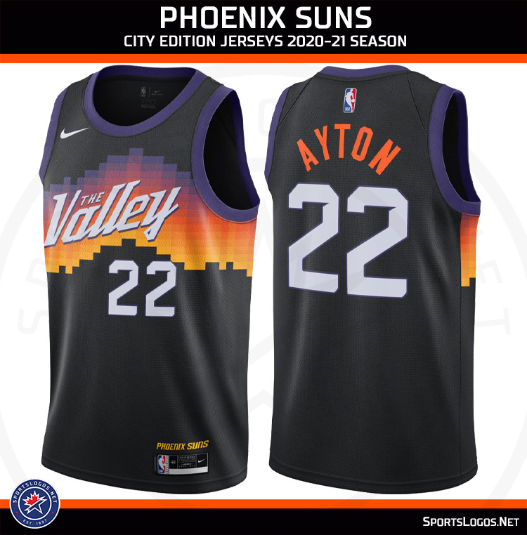
The Suns are paying tribute to their city’s nickname, the Valley of the Sun, with their black city jerseys with a striking desert sunset across the front. The purple to red to digitized orange gradient strikes first. The words “The Valley” are carved out in white, center chest. These jerseys are as hot as the sun itself and should be a candidate to sell out quickly.
Chicago Bulls

The Bulls city jersey is almost perfect. The color scheme of black and gold, with Bull’s red trim on the numbers, in a font similar to the street signs of the windy city, gives off the feeling of a jersey set in the roaring 20s. The zig-zagging gold lines going down the side panels of the jersey are intricate and beautifully artistic. The color scheme, font, and geometric lines all play well together and form an elegant city edition jersey. In the windy city, these city jerseys blow away the competition.